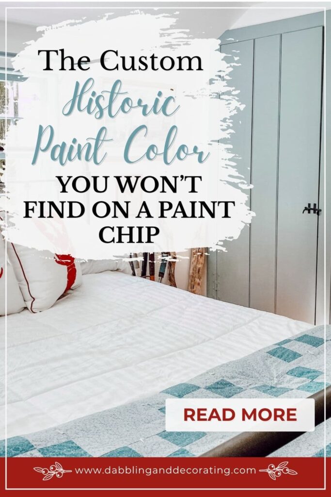


Discover the custom historic paint color used on the interior trim and doors throughout our New England colonial, including the exact blue-gray formula.
Whether you’re restoring an old colonial, building a New England-inspired home, or simply searching for the perfect historic paint color, choosing the right one can feel overwhelming. After all, the paint colors you choose help tell the story of your home. Today, I’m sharing the custom historic paint formula we’ve used on the trim and doors throughout our early American home’s four bedrooms for decades. Originally chosen by my parents more than 30 years ago, it was a color I never considered changing when we repainted. Instead, we had it custom matched, and today it’s still one of the defining details of our home’s timeless New England style. Better yet, I’m sharing the exact formula so you can take it to your local paint store and recreate the look in your own home.
In My Mother’s Maine Home
Step inside our inherited coastal Maine home where antiques, thrifted treasures, and family memories come together. Explore the full series for room-by-room decorating ideas, restoration updates, and the story behind this special place.
The Story Behind This Custom Historic Paint Color
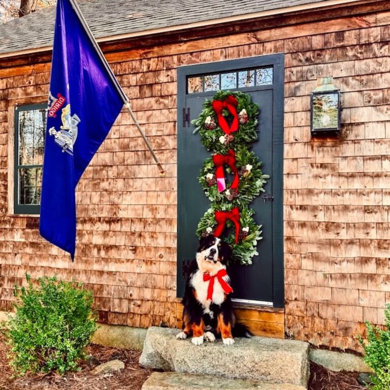
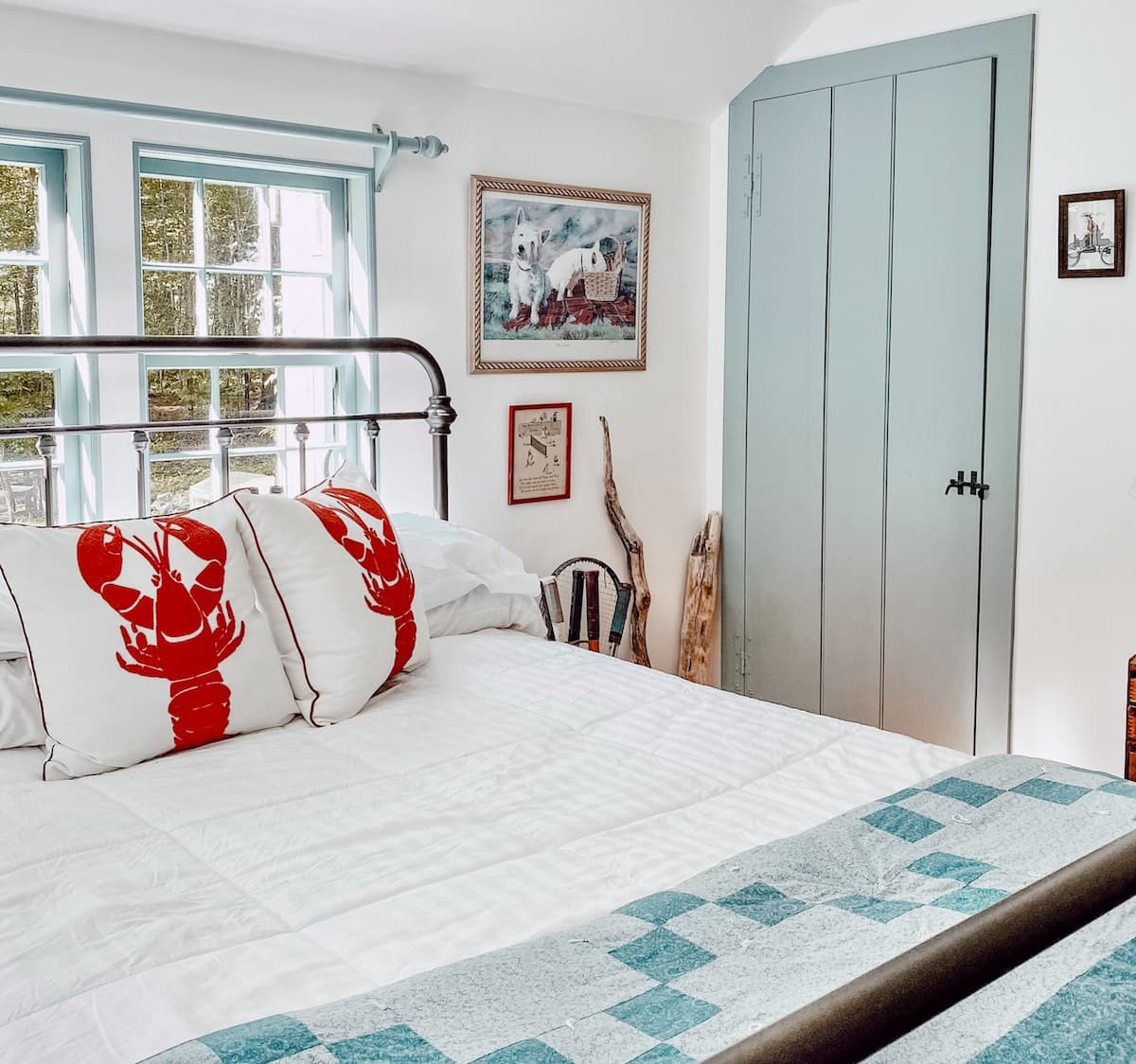
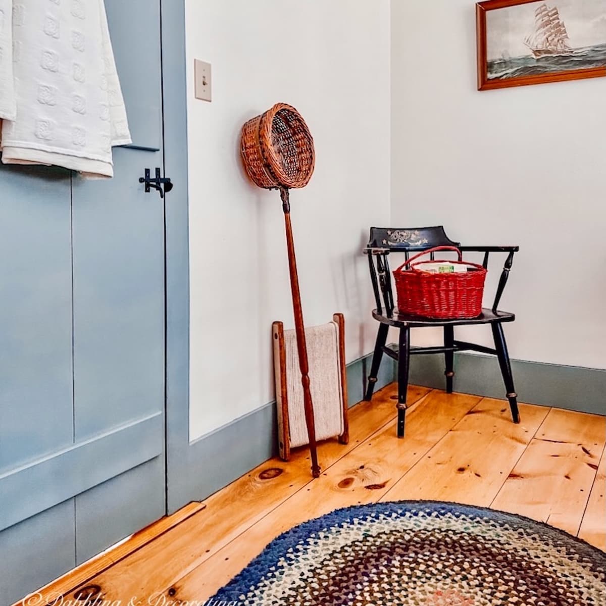
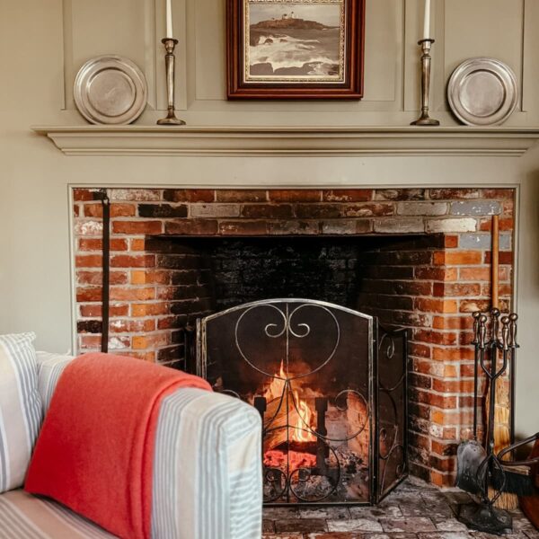
When my parents built our Raeside-Dame home more than 30 years ago, a replica of an early American New England colonial, a style well known throughout the Maine and New Hampshire seacoast, they carefully chose every detail to honor its traditional character. The interior trim throughout the main living areas was painted Benjamin Moore Nantucket Gray, while my mother selected a soft custom blue-gray for the bedroom trim and doors. It’s a color I’ve admired ever since, with just enough warmth to complement the Nantucket Gray while still feeling timeless, classic, and perfectly at home in a New England colonial.
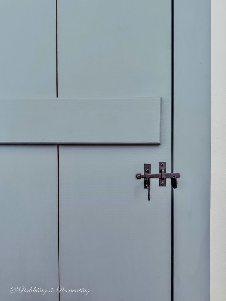
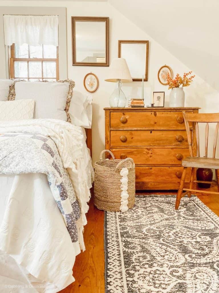
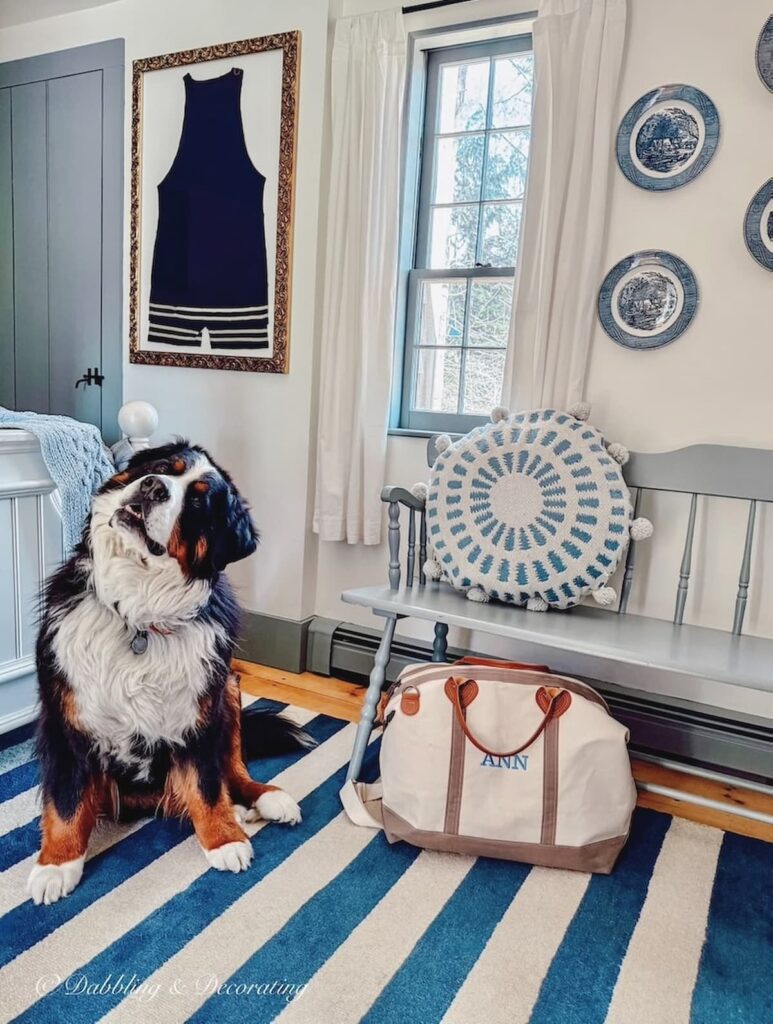
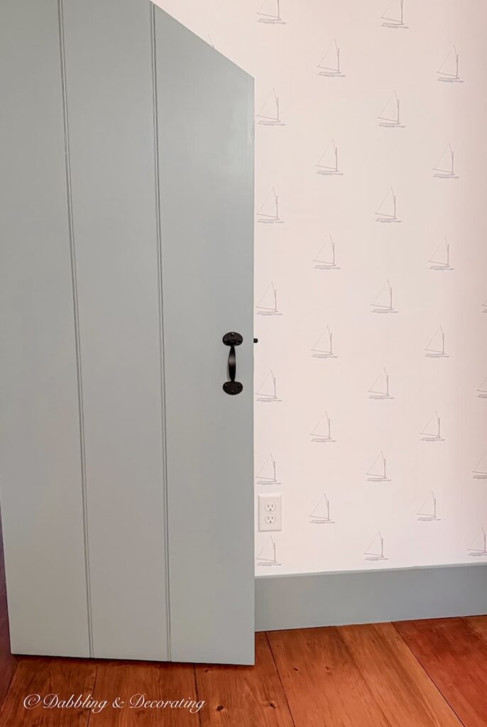
Years later, when I inherited the home, repainting the interior gave me the opportunity to change anything I wanted. But this wasn’t one of those things. We had the original blue professionally color-matched so we could use it again throughout all four bedrooms, two bathrooms, and later on the trim in our newly finished attic guest rooms. Like many early American homes, some of these rooms receive very little natural light while others are bright and sunny, allowing this custom color to reveal its beautiful range. In brighter rooms it feels soft and airy; in darker spaces it becomes richer and moodier, proving that the right historic paint color can become part of a home’s style for generations.
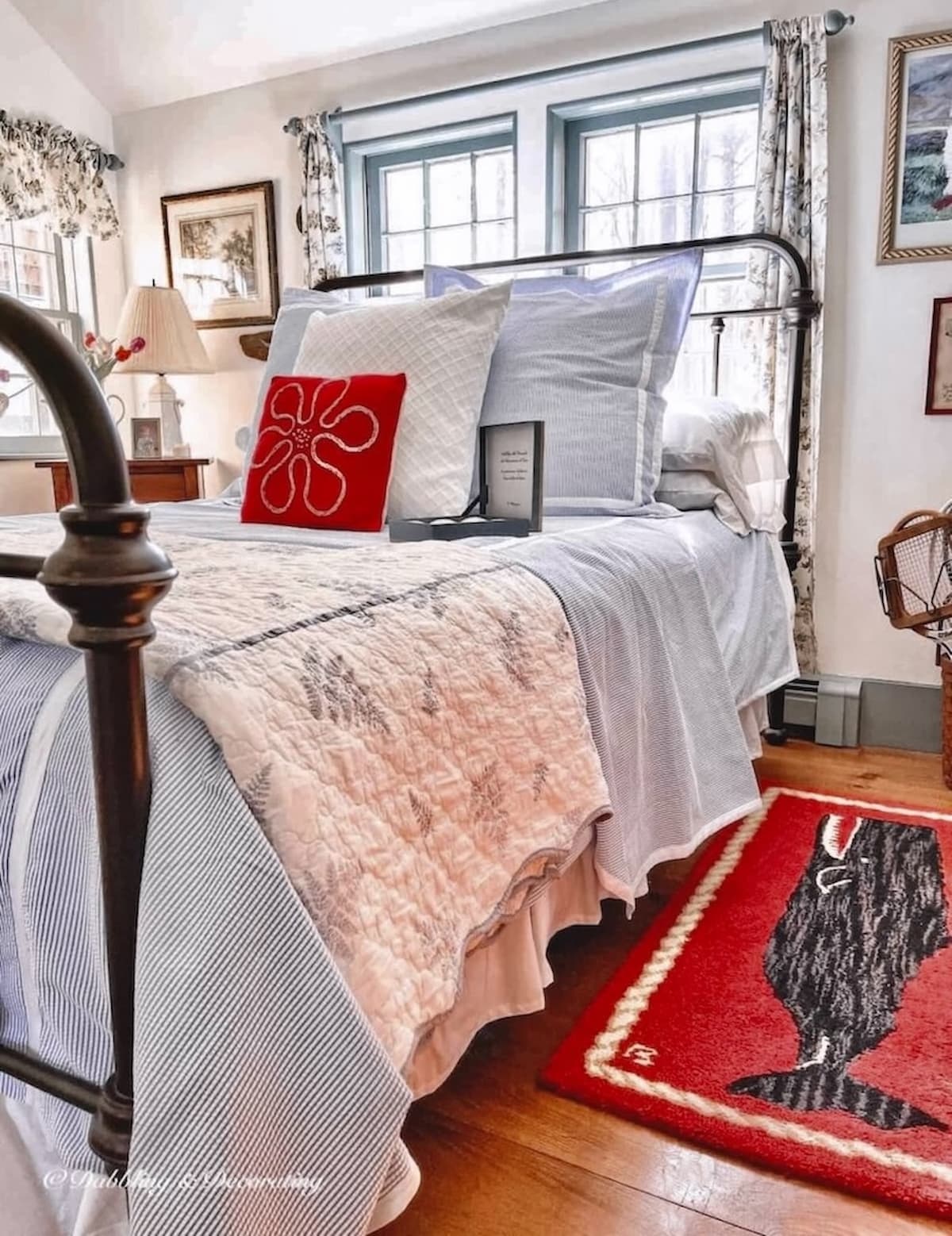

A Note About These Photos
Like every paint color, this custom blue-gray changes throughout the day depending on the light, the room, and even the camera. Some of these photos were taken years apart, in different seasons, and have been edited for blog photography, so you may notice the color reading slightly bluer in one room and a little grayer in another. That’s actually one of the reasons I love it; it’s a soft, complex historic color that never feels flat or one-dimensional.
Our Custom Historic Paint Color Formula
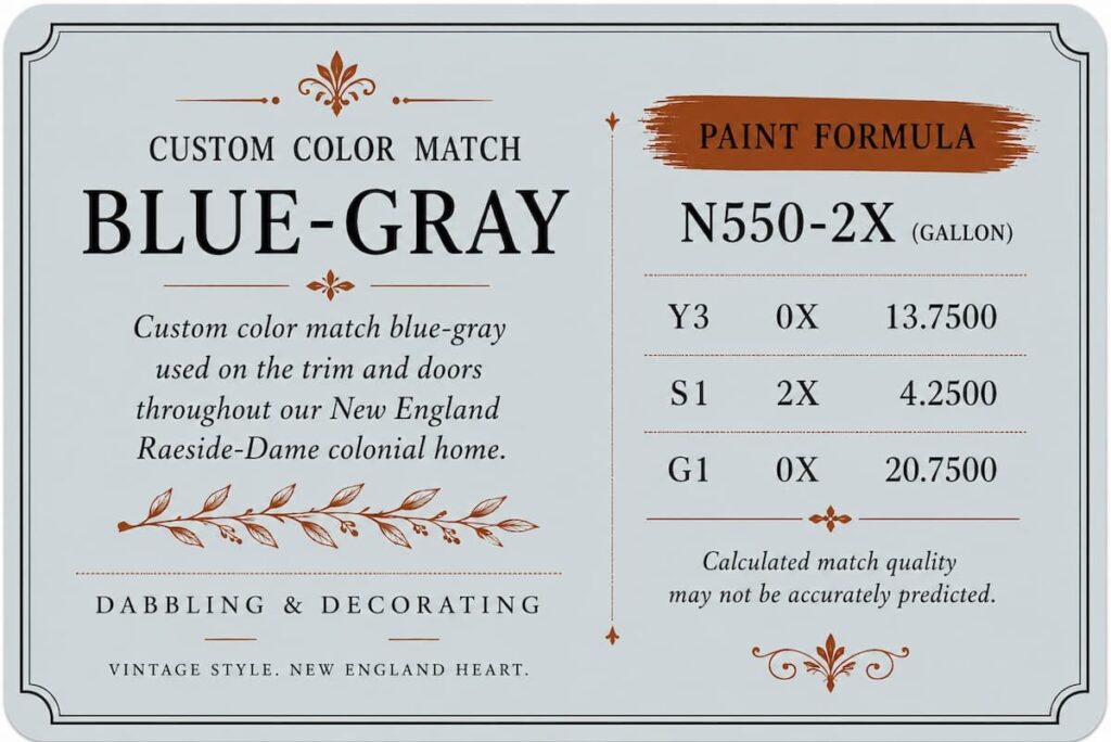
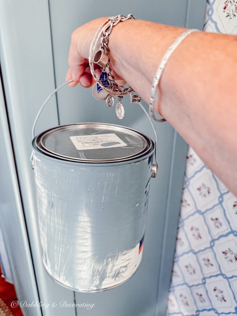
When it was time to repaint, I didn’t know the original name of this soft blue-gray, or whether it had ever been a standard paint color at all. Instead, we brought a chip of the original paint to our local Benjamin Moore retailer and had it professionally color-matched. The result is the custom formula below, which allowed us to preserve the same historic paint color my mother chose more than 30 years ago. It’s one of the questions readers ask me most often, so I’m excited to finally share it.
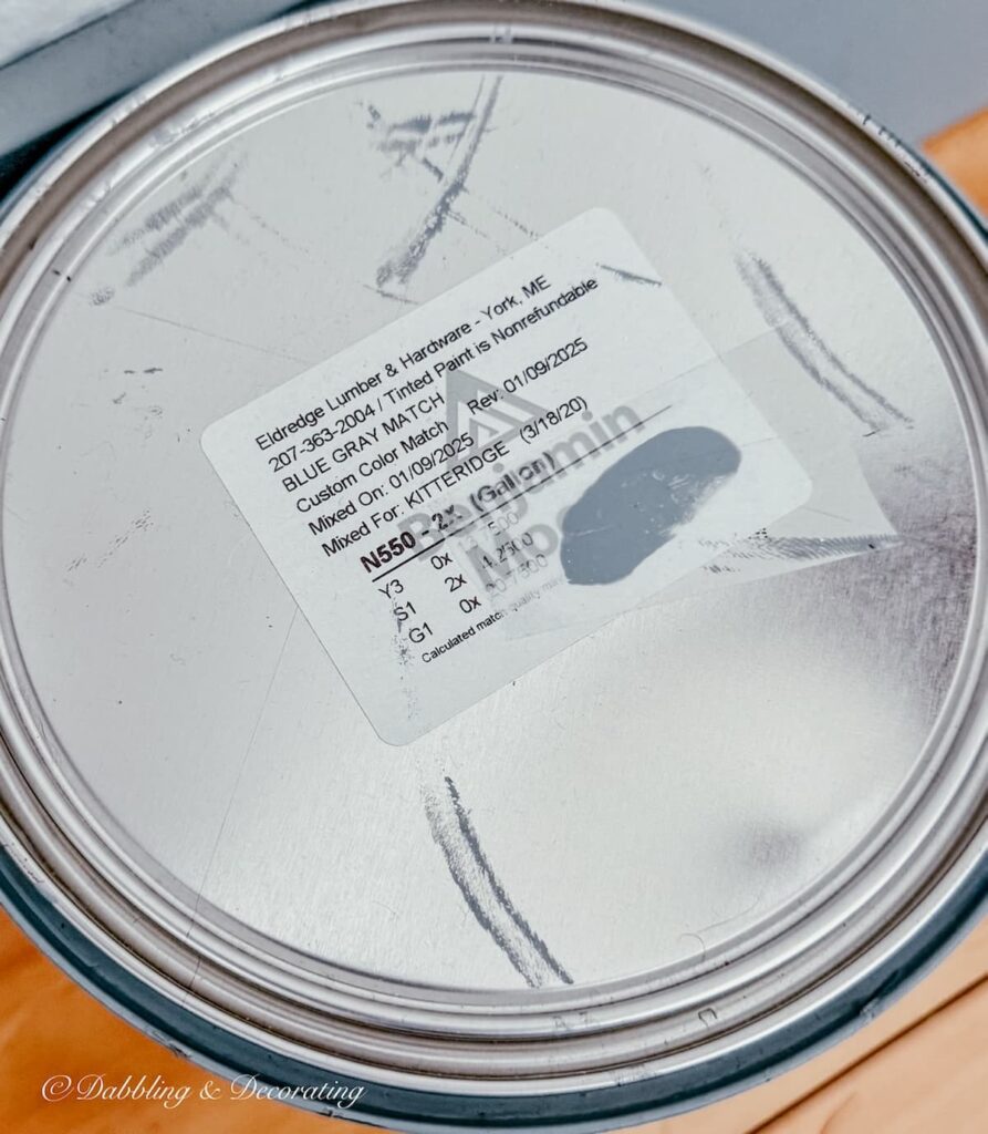
Pro Tip
Because paint formulas can vary by brand, product line, sheen, and container size, bring this formula and the photograph of the original label to your local paint retailer. Ask them to create a sample first so you can test it in your own lighting before committing to a full gallon.
The White Paint That Completes the Look
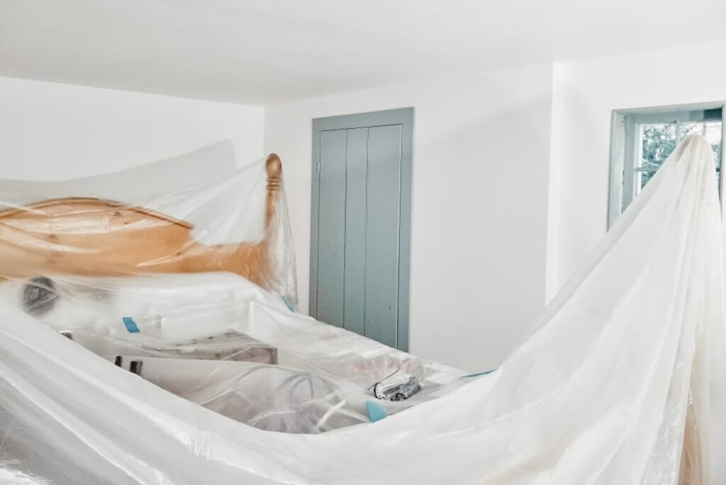
When we repainted our New England colonial, we decided to brighten the walls with Benjamin Moore Simply White while keeping the original custom blue-gray trim and Benjamin Moore Nantucket Gray throughout the rest of the home. My parents had originally chosen a warmer cream for the walls, but after more than 30 years it had begun to feel a little tired. Simply White was the perfect update. It brightened every room without taking away from the home’s historic character, and against our original plaster walls, it still feels soft, timeless, and authentic rather than stark or modern.
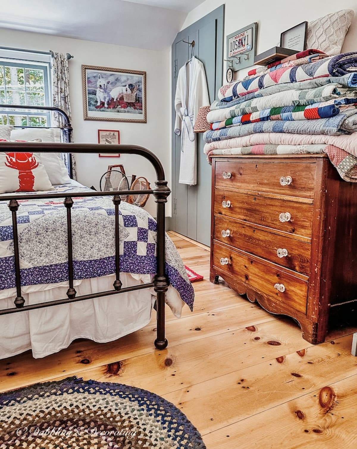
I especially love the way Simply White pairs with this custom historic blue paint color. The crisp white allows the blue-gray trim and doors to stand out while keeping the entire house feeling light and welcoming. Although Simply White is one of Benjamin Moore’s brighter whites, it never feels cold in our old colonial home. If I were choosing a white paint for a historic New England home again, I wouldn’t hesitate to use Simply White.
Decorating Tip:
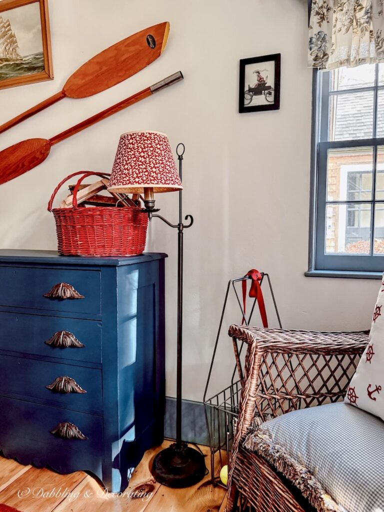
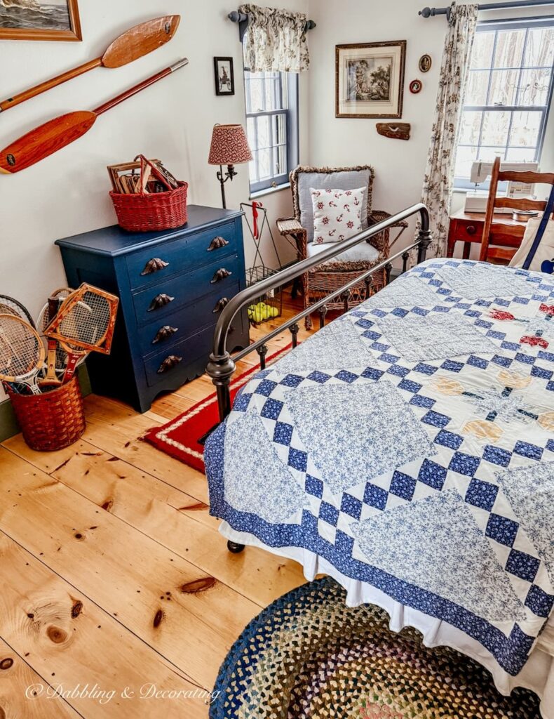
Don’t stop at the trim! I’ve used this custom blue-gray on this handmade bathroom cabinet, vintage stools, benches, baskets, and a roadside wardrobe throughout our home. Repeating the same historic paint color on furniture helps create the layered, timeless look that makes an old New England home feel collected over time.
Benjamin Moore Paint Colors Similar to Our Custom Historic Blue-Gray
Although our home’s trim color is a custom match, several Benjamin Moore historic paint colors capture a very similar look. If you’d rather start with a named paint color instead of a custom formula, these are the ones I would compare first. As always, I recommend painting a sample board and viewing it throughout the day before making your final decision, especially in an older home where natural light can vary dramatically from room to room.
Van Courtland Blue HC-145
Probably the closest Benjamin Moore color to our custom blue-gray. It’s a soft, muted historic blue with just enough gray to feel timeless in a colonial or early American home. If I had to choose the closest Benjamin Moore color, this would be my first choice.
Whipple Blue HC-152
A beautiful historic blue-gray with slightly more depth than our custom color. It works especially well in rooms with plenty of natural light.
Buxton Blue HC-149
A classic colonial blue that feels fresh without becoming too bright. It has a soft, welcoming quality that’s perfect for traditional homes.
Mount Saint Anne 1565
A sophisticated blue-gray with slightly cooler undertones. If you’re looking for a little more gray than blue, this one is worth sampling.
Smoke 2122-40
A quiet blue-gray that leans more neutral than our custom color. It’s a lovely option if you want a softer, understated historic palette.
Wedgewood Gray HC-146
Although Wedgewood Gray is often recommended for historic homes, and it’s a color I’ve also used and love in our Vermont home, it leans noticeably more blue-green than our custom paint color. If you’re hoping for a softer colonial color with just a touch more green, Wedgewood Gray is a beautiful alternative.
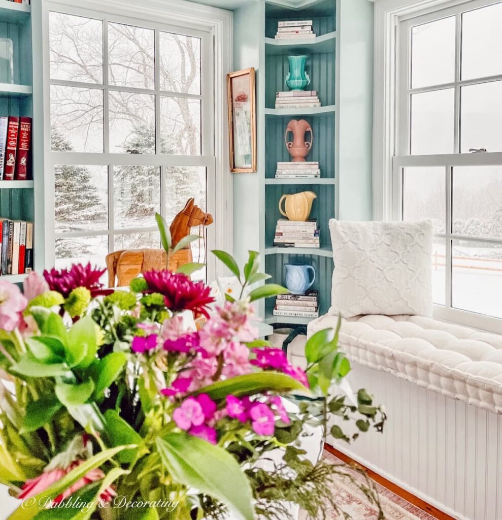
While these Benjamin Moore colors are beautiful alternatives, I’ll always have a soft spot for our family’s custom blue-gray. More than 30 years after my parents first chose it, it’s still the color that feels most at home in our New England colonial.
Sunday Home Style
Inspired by homes that feel like Sunday—quiet, layered, and filled with familiar finds. These styling tips share the vintage touches, everyday rituals, and warm moments that make a home feel like you.
Why This Historic Paint Color Still Feels Right at Home
Some paint colors come and go with decorating trends, but every once in a while you find one that simply feels like home. For our family, this custom historic paint color has done exactly that. My parents chose it more than 30 years ago, and after living with it myself, I never wanted to replace it. From the bedrooms and bathrooms to painted furniture and our attic guest rooms, it’s a color that has quietly become part of our home’s story.
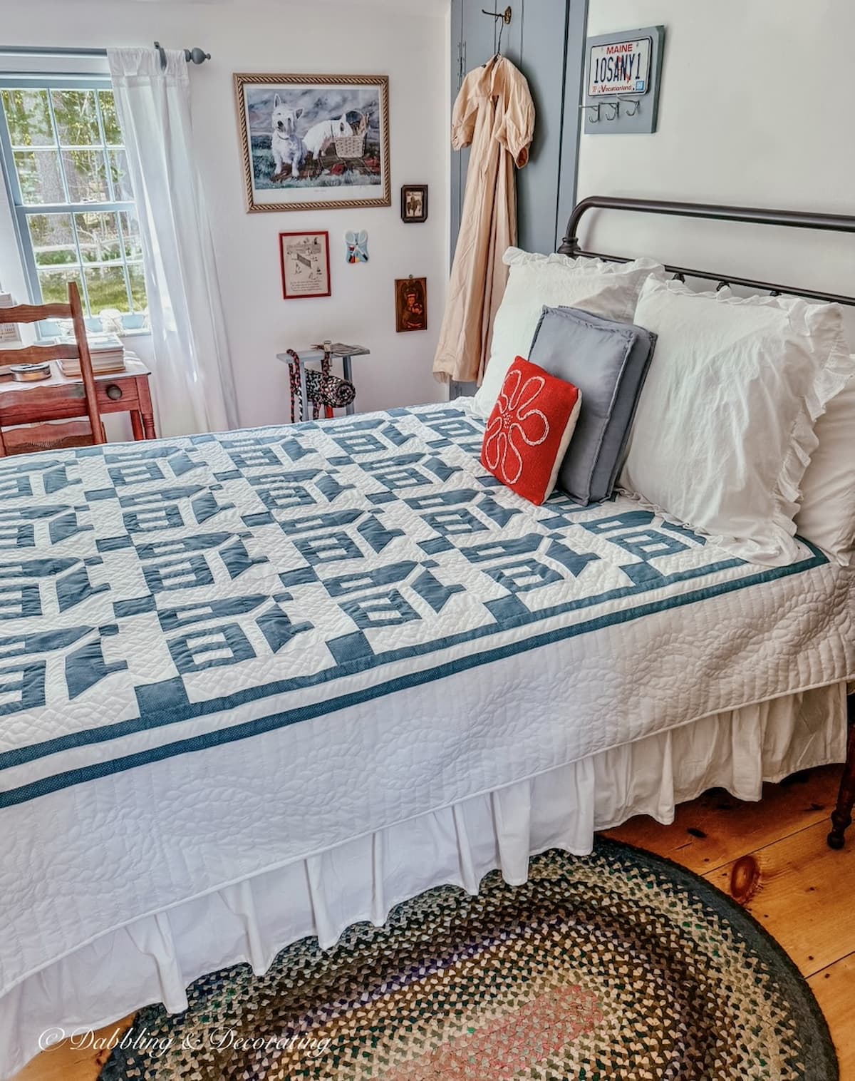
Whether you’re restoring an old home, building a New England-inspired colonial, or simply searching for a historic paint color with timeless character, I hope our family’s custom formula inspires you as much as it has inspired me over the years.
If you decide to try it, I’d love to hear how it looks in your home.
The Vintage Posts Readers Love Most
Start with the posts readers come back to again and again. These vintage decorating ideas are rooted in New England, styled with thrifted and antique finds, and filled with real-life tips you can use in your own home. Familiar Finds, Styled Your Way.
How to Start a Vintage Booth: Tips, Display Ideas, and Lessons Learned
Eclectic Decorating Style Guide: How to Layer Vintage, Antique, and Thrifted Decor
9 Vintage Booth Displays That Made Me Stop (And What You Can Learn From Them)
Scandinavian Spring Homes: 10 Light and Airy Cottage Tours to Inspire
Antique Oil Lamps: How to Repurpose Them Into Unique Flower Vases
More Paint Colors from Our New England Homes
Every paint color in our homes has been carefully chosen to complement antiques, vintage finds, and the timeless character of New England living. Browse more of our favorite colors below and see how we’ve used them throughout our homes.
Frequently Asked Questions About Historic Paint Color
A historic paint color is inspired by the pigments and palettes commonly used in older homes and traditional architectural styles. These colors are often softer and more muted than modern shades, helping them complement aged plaster, natural wood, antique furnishings, and the architectural details found in colonial and early American homes.
The bedroom and bathroom trim, interior doors, and several painted furniture pieces in our New England colonial are finished in a custom-matched blue-gray. My mother originally chose the color more than 30 years ago, and when the house was repainted, we had a chip of the original paint professionally matched so we could preserve the same look.
You can bring the formula card and a photograph of the original paint label to a professional paint retailer, but the results may vary depending on the brand, paint base, product line, and sheen. Ask the retailer to interpret the complete formula and mix a small sample before purchasing a full gallon.
In rooms with plenty of natural light, the color appears soft, airy, and distinctly blue-gray. In darker spaces, such as our attic bedrooms, it looks deeper and moodier and can reveal a subtle green undertone. This natural variation is one of the qualities I love most about the color.
We paired our custom blue-gray with Benjamin Moore Simply White on the plaster walls throughout our Maine home. Simply White brightens the rooms without feeling overly stark or modern, and it works beautifully alongside both the custom blue-gray and Benjamin Moore Nantucket Gray.
Join the Vintage Circle — Familiar Finds, Styled Your Way™
Love vintage treasures, thrifted gems, and a home that tells your story? Leave a comment, share this post with a kindred spirit, or head to my Start Here page to explore more. Want fresh prompts and timeless ideas? Subscribe to join our Seasonal Vintage Decor Styling Challenge for weekly inspiration and behind-the-scenes peeks.
Pin it for later!